A gallery of recent maps
This post presents a selection of maps I have produced in the last few weeks. If you follow me on Twitter or on Reddit you will have seen most of these already. All the images below are clickable thumbnails which link to a full-size version.
Electrification
This animated map shows, per municipality in South Africa, over a 20 year period, the percentage of households that use electricity as their main energy source for lighting. (As distinct from heating or cooking — households which have electric light may still use gas or wood for other purposes.)
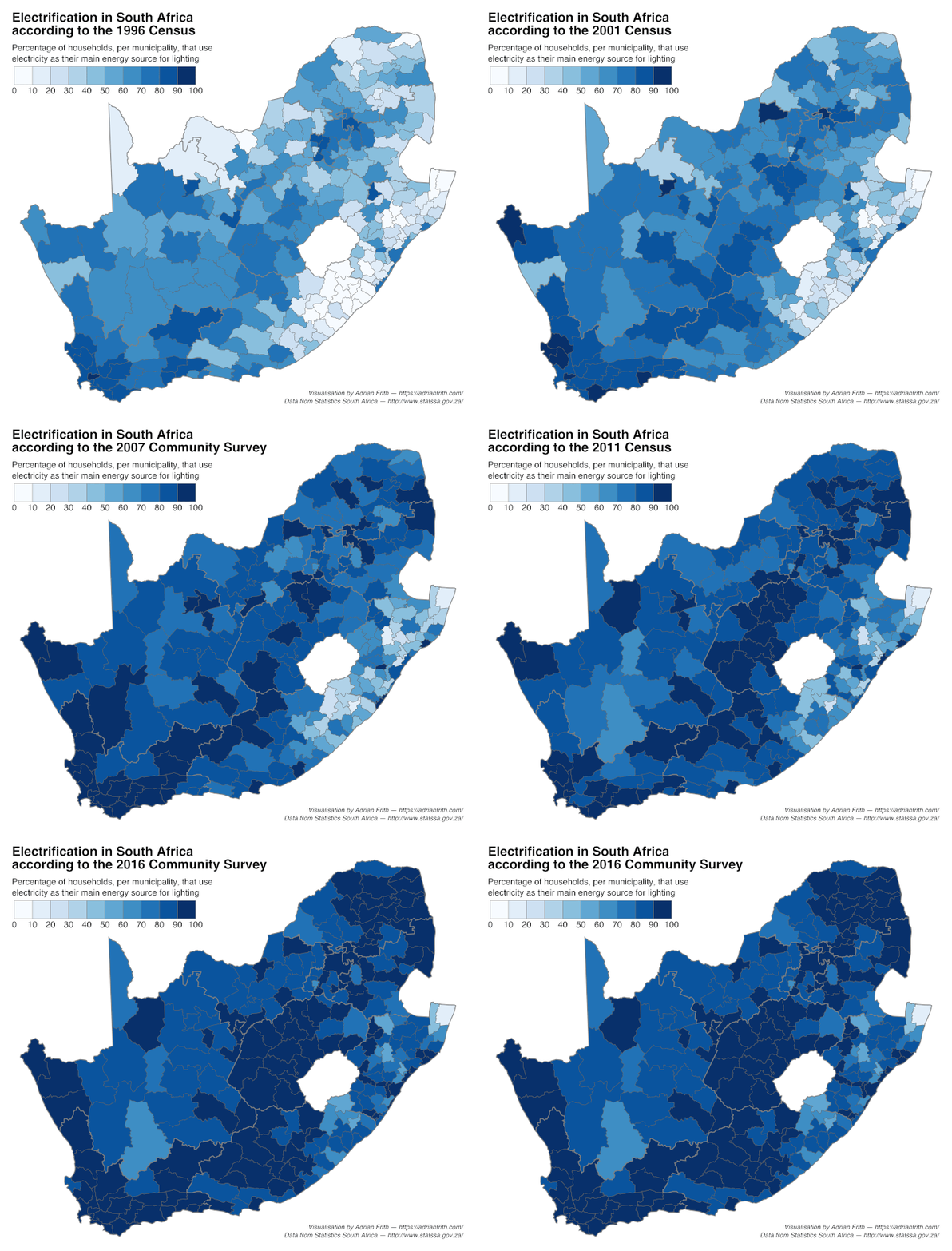
The data comes from the 1996, 2001 and 2011 Censuses and the 2007 and 2016 Community Surveys, all carried out by Stats SA and accessible through its SuperWeb platform. I have collected the data that these maps are based on into a CSV here. As municipal boundaries change from time to time, all the data has been normalised to the municipal boundaries as of 2011, the shapefile of which can be downloaded here.
A note: I don’t think there was actually a big regression from 2007 to 2011; rather I suspect the Community Survey 2007 was inaccurate, especially in the sparsely-populated western part of the country where the sample would have been very small.
Overstrand land ownership
This map shows state, municipal and private land ownership in the Overstrand Municipality, which lies along the coast southeast of Cape Town. It also shows the distinction between town erven and farm portions.
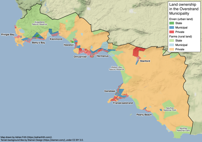
The geographic data for land parcels comes from the Surveyor-General’s Office via PlanetGIS, while the land ownership data comes from the Overstrand Municipality’s valuation register. The background terrain tiles are Stamen Design’s Terrain Background (under CC-BY-3.0 license). I used PostGIS to wrangle the data, which required substantial cleaning to match up the parcel shapefile with the valuation roll.
Change in population density
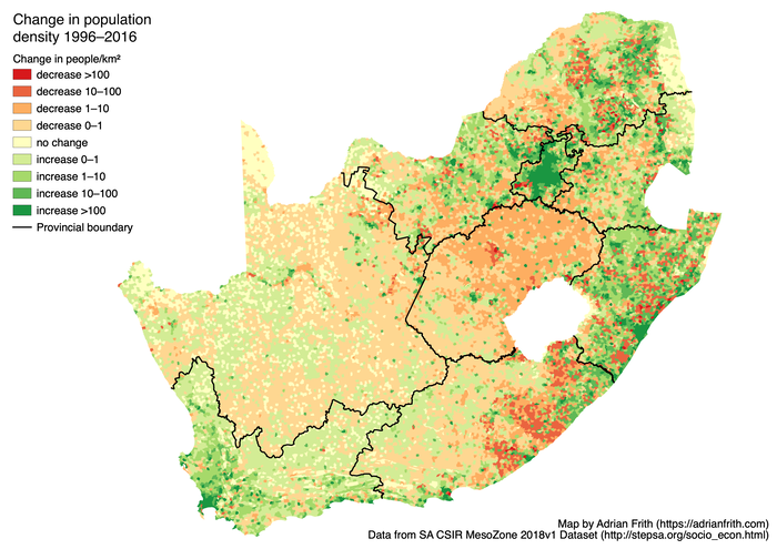
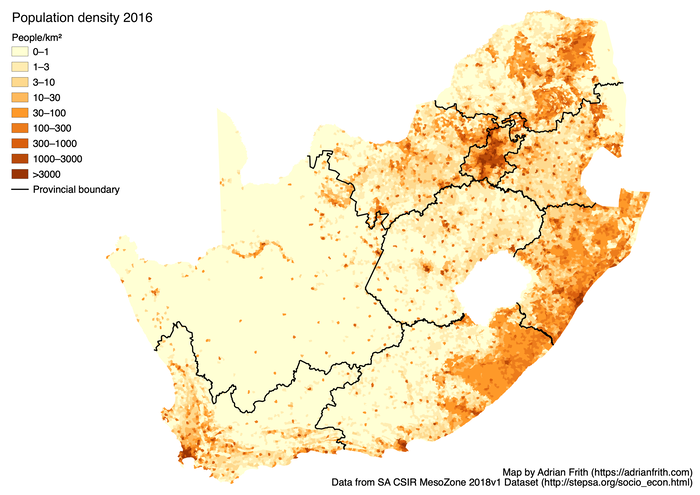
This map shows the change in population density in South Africa over 20 years (1996 to 2016). The biggest trend this map shows is the rural-to-urban migration, with all the major cities showing a big increase in population. But across the rural parts of the country there is substantial variation; some areas like the Free State have a uniform decrease, while many of the former homeland areas show an increase in population (probably though births not migration). The data comes from the SA CSIR MesoZone 2018v1 Dataset.
For comparison, here is the population density in 2016.
Dam capacity
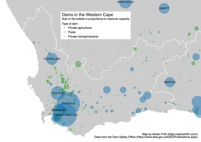
This map shows the capacity of South Africa’s dams and reservoirs; each circle is sized in proportion to the storage capacity of the dam when full. The data comes from the Dam Safety Office of the Department of Water and Sanitation.
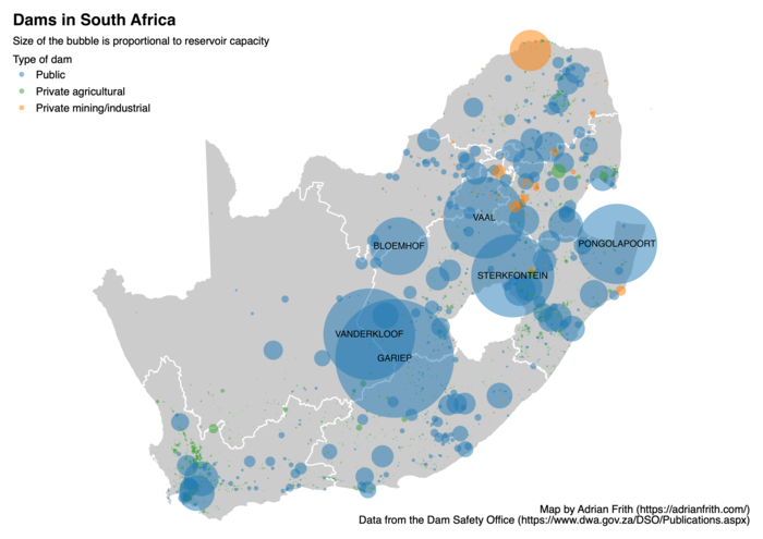
I was also requested to produce a map for the Western Cape.
