
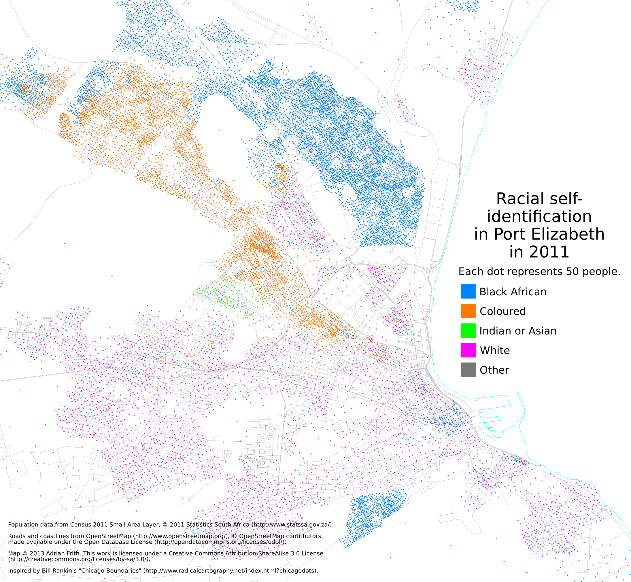
Dot-maps of racial distribution in South African cities
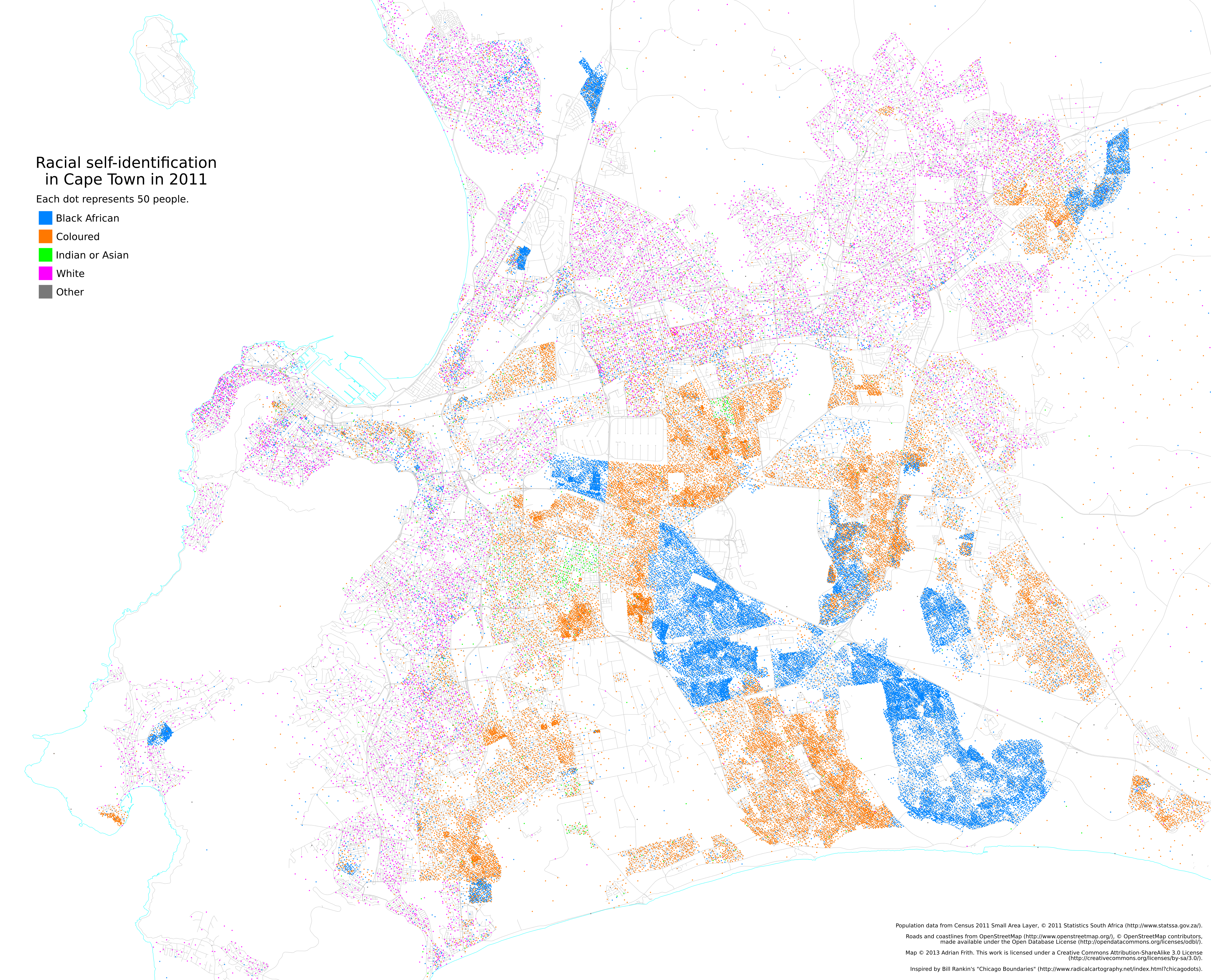
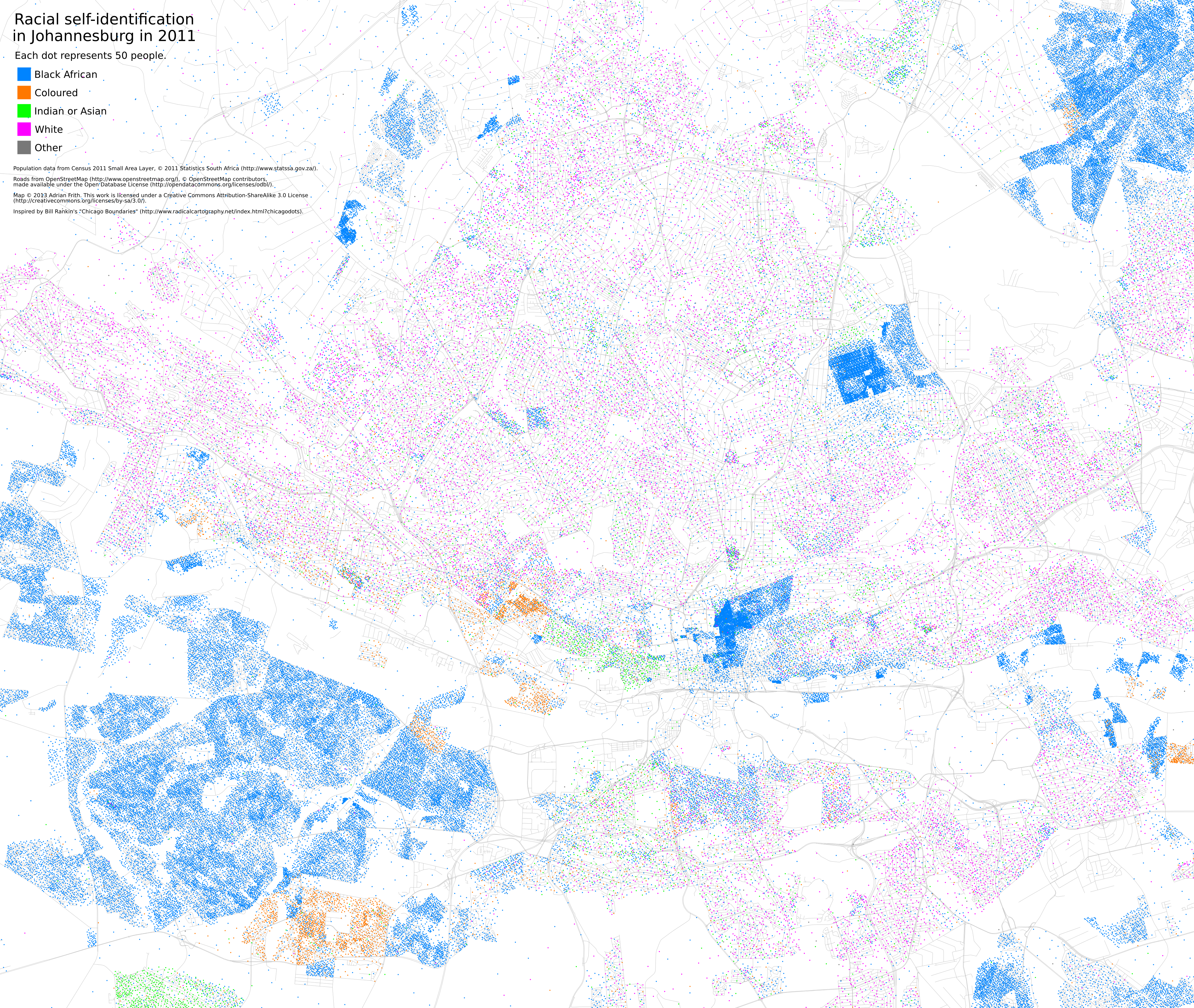
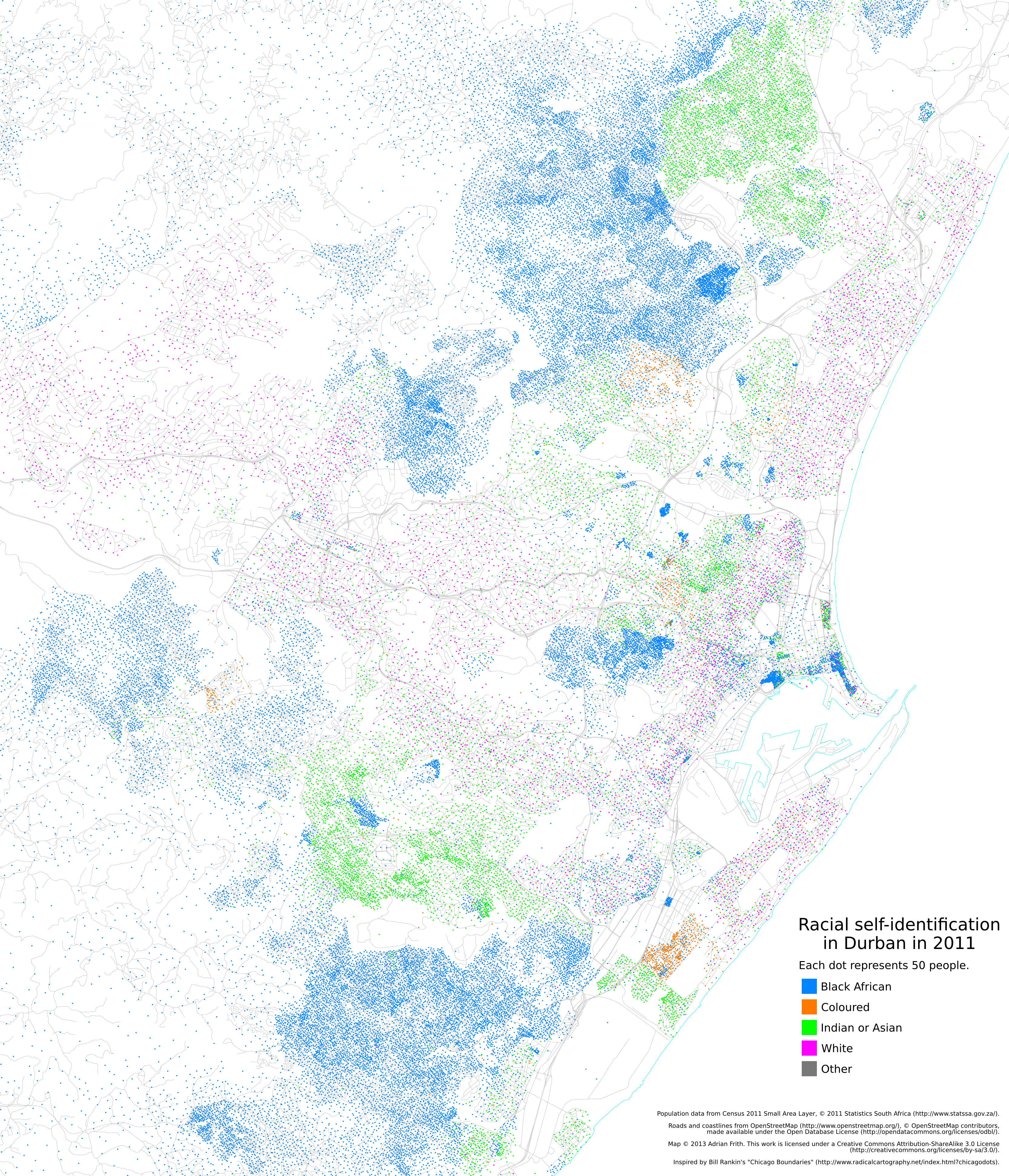
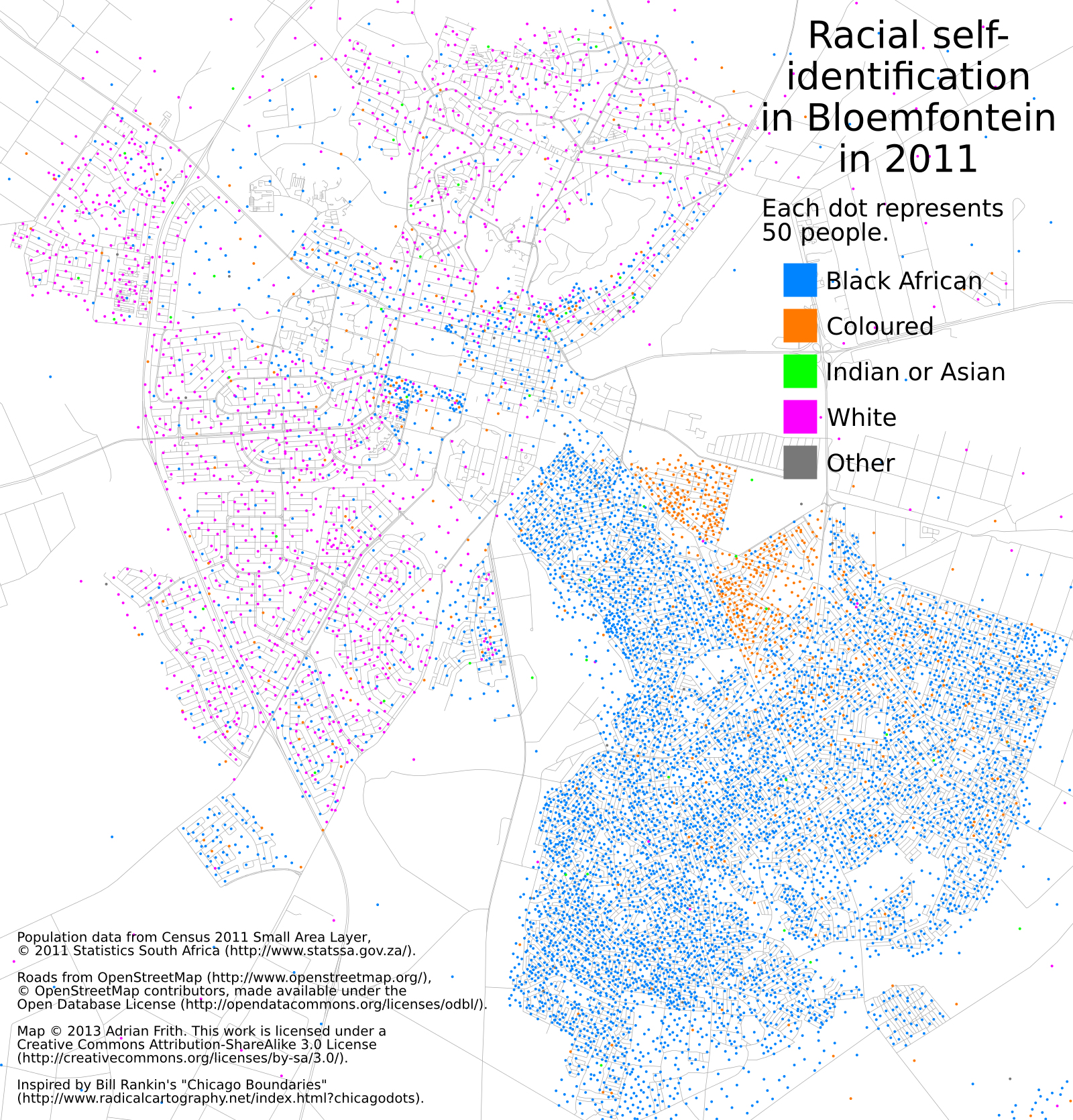
Inspired by Bill Rankin’s “Chicago Boundaries”, and having finally obtained a copy of the small-area data from Census 2011, I decided to draw some similar dot-maps showing how the population is distributed in South African cities. The primary lesson from these is that the legacy of apartheid is still very clearly visible. I suppose that was to be expected.
UPDATE: click here for my new post with comparable maps from the 2001 census.
UPDATE 2: click here for a zoomable, scrollable map of the whole country.
In each map, one dot represents 50 people. Here’s Cape Town (with all of these, click for a full-size version):
Johannesburg:
Durban:
I’ve also made maps for Bloemfontein, East London, Port Elizabeth and Pretoria.
Written on September 8, 2013